- July 20, 2021
- Laura Silva, Marketing Program Manager

No matter what type of form you use to fill out, you must make it simple to use. Complex online forms can overwhelm your customers and make them leave. Studies show that a single column form layout performs better than multiple-column form layouts. But first, let’s examine what web form layout means.
What is web form layout?
Web form layout is the way in which all aspects of your form are arranged and where the form is placed on a given web page. Your web form’s layout should be thoughtfully organized and look both simplistic and professional.
Why does web form layout matter?
Your web form layout plays a large role in how well your form converts. That’s because a great form layout leads to seamless form completion and improves the submission process for your visitors. Visitors will easily convert since you’ve created a web form that’s hassle-free and feels both professional and thoughtful.
In contrast, a poorly planned layout will lead to a confusing and difficult-to-work-through form that may frustrate your visitors and even cause them to abandon your site entirely, diminishing your conversions.
When it comes to your layout, you should keep the location and order of all your fields as straightforward as possible. This means you should use a single-column layout. By organizing your fields this way, your visitors won’t miss a field, they’ll complete the fields in the order that makes the most sense, and they’ll be able to submit your form faster than they would if you used a multi-column form.
Great example:
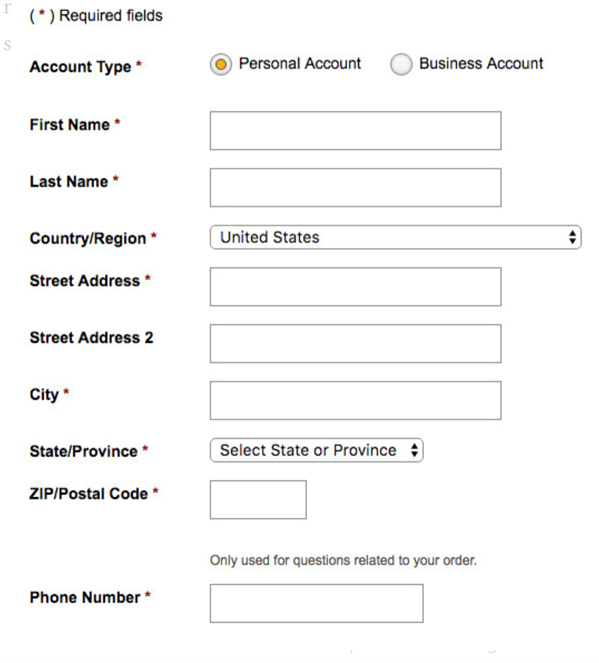
This example shows you what a single-column format should look like. The layout is just about as streamlined, straightforward, and minimalist as it could possibly be, which is exactly what you want. This way, you decrease the amount of time your visitors need to work through your form and there’s no possible cause for error or confusion.
This has been well researched in eye-tracking studies (including our own), case studies, and A/B tests. When you’re deciding between a single-column or multi-column form design, default to the single column.
In the CXL study, survey participants completed the linear, single-column form (n = 356) an average of 15.4 seconds faster than the multi-column form (n = 346). This was significantly faster at a 95% confidence level.
This guideline isn’t new. In fact, it’s been around for years, but until our study, there wasn’t much quantitative evidence for it. Still, those in conversion optimization will have undoubtedly seen dozens of compelling user tests, as well as A/B tests, that show single columns to be more usable.
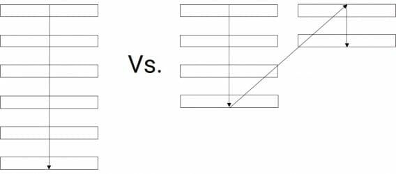
One of the problems with form fields in multiple columns is that your users are likely to interpret the fields inconsistently. When you use a two-column layout, you introduce the possibility of different interpretations. The most common among users is to scan in Z patterns, slowing the speed of comprehension and obscuring the path to completion. However, if a form is in a single column, the path to completion is a straight line down the page.
Below you’ll find 5 different ways to interpret how the form fields relate when they are arranged in a standard two column layout.
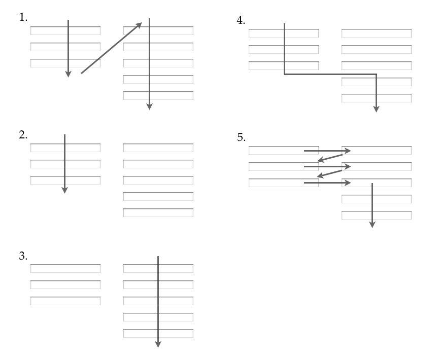
As you can see, since there are multiple ways for users to anticipate how they should fill out web forms, it’s a good idea to use only one column so they don’t miss anything. In this way, your forms will enable your users to get an easy start—and keep going straight down, filling out all fields, until they hit submit.