

- July 27, 2021
- Amy Glancy, Account Executive, Public Sector

Fillable forms are essential for any business that relies on them. It is important to encourage users to fill them in. Users are taking the time to complete forms, whether they’re signing up for your webinar, receiving your newsletter, or contacting you.
To reduce form abandonment, it is crucial to make PDF forms as straightforward as possible when creating them. Good PDF form design is a simple way to increase the completion rate and lead generation, leading to higher revenue and increased revenue. This makes you a hero!
A proper alignment of text, fields, and labels is one of the easiest ways to make forms more user-friendly. Here’s how.
For readability and completion, top-left aligned labels work best
Google’s UX experts discovered that aligning labels higher than fields on the left increased form completion times. It requires fewer visual fixations, which is the orientation of your eyes so that the image you view falls on the central portion of your retina. This is where your eye focuses.
Users will find it more challenging to read, understand, and complete form fields if they have to fixate visually again and again. Below is an example of visual fixations that are less frequent on the left vs. the right.
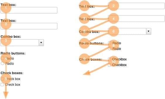
If in doubt, align all your text (questions or labels) on the left side of your form to make it easy to read and complete for visitors.
Placement of labels and lines
Optimizing web forms is a matter of label and line placement. Labels can be placed at the top, right, or left. Each of these options is sufficient. We discuss these options below.
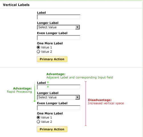
Top aligned labels
For efficient scanning and rapid processing of forms and input fields, top-aligned labels are essential. It also reduces the time it takes to complete a form. However, if there isn’t enough vertical space, the form will not work. Take a look at the following example.
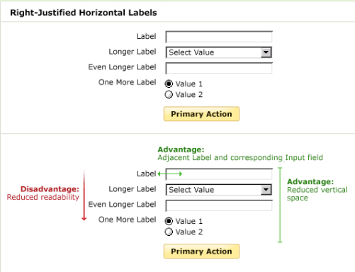
Labels that align-right
Right-aligned labels have a clear association between field and label and take up less space. It’s more challenging to digest than top-aligned labels, but it has the fastest completion times.
Labels left-aligned
Left-aligned labels can be used for label scanning and require less vertical space than right-aligned. However, the downside is that users will take longer to complete due to the distance between labels and input fields.

The best practice is to use the options listed above
Top-aligned labels allow for faster processing and shorter completion times. Use a right-aligned label when vertical space is a problem. Last but not least, left-aligned labels are most helpful when entering unfamiliar or complex data.
In the following cases, left-aligned labels can be handy:
* If the data you require is not known
* Allows label scanning
* There is a less clear association between field and label
* Requires less vertical area
* Changes in the length of labels may affect the layout
It is easier to read the left-aligned text because English readers are familiar with this format. It provides a consistent area where users can focus their attention when they complete each line. This makes it easy to read all fields of your form. And as we all know, simpler is better.